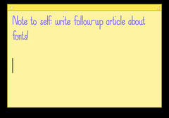
 I wrote this note in a "stickie", then took a screenshot!While I was writing the blog post entitled Handwriting on the Web, I was quite surprised that the typeface appeared as it was intended to: I’d assumed I’d have to take a screenshot of it to make it appear properly in a web browser. As it turns out, my original instincts were correct.
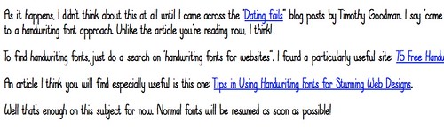
Or, possibly, partially correct. On some computers it looks the way I intended, and on others it looks like an ordinary sans serif font.
So, here is the typeface as I saw it in my blog editor:
 To show this, I took a screenshot in my blog editor
My conclusion: handwriting fonts are best used in small doses, and displayed as a graphic, i.e. a screenshot, rather than text.