I needed a single stroke font for some laser cutting. You’d think that would be an easy thing… Well, keep reading.
When laser etching, any font could be used. You can raster etch the type, or “vector etch” the type. Raster etching takes a long time, and vector etching (basically doing a low-power vector “cut”) is fast. If you’re doing 3,000 pieces, the time can make a huge difference!

Here’s a normal font in Inkscape. Fonts consist of an outline which is then filled with a color. In this case, the outline of the font is filled with black and you see what you normally see when viewing a font on a computer screen.

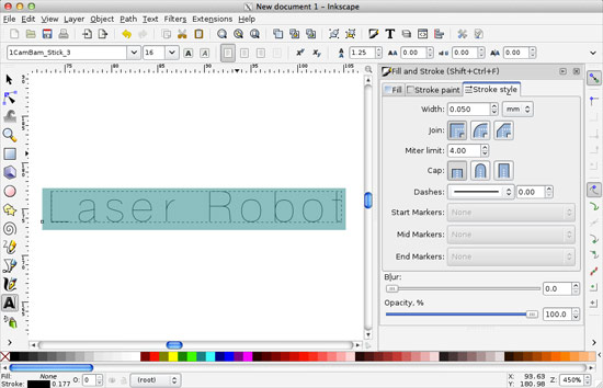
Here’s the normal font with the fill set to none and the stroke (outline) set to a thin line. You could laser etch this (and some people do) but you’re now outlining the letters instead of just etching them with a single stroke. This is fine, but takes more time. Since going really fast is our goal, this doesn’t work.
At this point, you may be thinking “No problem! Our pals at Evil Mad Scientist Laboratories have us covered with Hershey text, and engraving font!” Indeed, Hershey text is awesome, but not always the right solution. I use Hershey text often, and it’s lovely, but let’s keep exploring…
I found these CamBam fonts, which probably work quite well for a spinning bit that is cutting material, but there’s an issue:
All the fonts are built using a 100% overlap in the font design, which tricks my TrueType font design program into thinking they are really looped TrueType fonts, when they really don’t have an inside and outside loop.
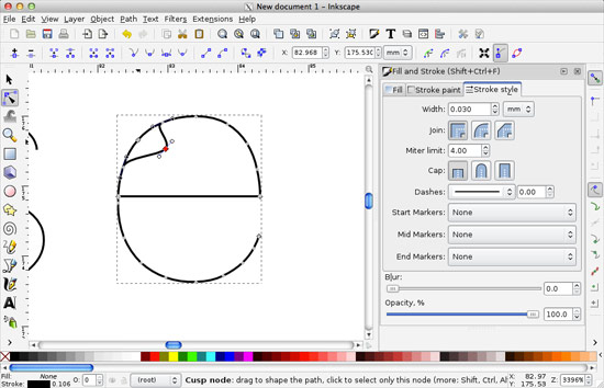
A spinning bit cutting material is quite different than a laser cutting material. If you use this font to laser etch, it will double up, which mean you’re lasering the same thing twice. This takes longer, and cuts your material twice. No good.
You can manually go in and delete the overlaps, but it’s a time-consuming pain, and you’ve got better things to do.

I found Machine Tool Gothic, which looks a bit weird when you first select it, but we’ll fix that. Remember that fonts are typically outlines that are filled with a color. That’s what is happening here.

We just need to set the fill to none, and give it a thin stroke. Much better! We’ve nearly got our clean single-stroke engraving font.

Let’s fix the weird lines that connect everything and close the paths. First you’ll want to convert the type to outlines (that’s the “Object to Path” command in Inkscape) and then select the two nodes at each end of the line you want to delete and use the “Delete segment between two non-endpoint nodes” feature to remove the line.

Oh, it’s worth noting that when you convert the type to paths, you lose the ability to edit it as type. More on that later. Here’s the “L” with no extra line connecting everything.
Now, it may look like only certain letters need the extra line deleted, but they all do. Go through each letter to delete the extra lines! If you’re doing a one-off project this may not matter as much, but if we are laser cutting 3,000 pieces, even an extra 5 or 10 seconds per piece will make a huge difference.

Here’s the real reason I wanted to use an editable typeface rather than the Hershey text extension. With text, you can place it on a path. This means you can curve the text onto a circle or some other shape. We want to make sure we’ve got the text exactly as we want it before removing the extra lines. (Remember that we need to change the editable type into outlines before we remove those extra lines.)

Don’t forget to remove the circle, or whatever path you used to place your text on.

Fire up the laser! Here’s our clean and ready to vector-etch single-stroke type.