Early this week, I posted a little graph of the economic history of the world, after 1 AD, from a research letter written by Michael Cembalest, chairman of market and investment strategy at JP Morgan. On Wednesday, I posted follow-up graphs to track GDP/capita -- a rough proxy for income, and even productivity -- through the last 2000 years. Here's the last installment.
You can call the graph below an "economic history of the world since Jesus." I've graphed each major power or region's share of world GDP since the year 1 AD (the data is in a PDF here). There is no data between 1 and 1000 AD, so I've put a little space there. The data does not provide for a clean X-axis -- note the differences between years -- but it provides a good rough picture of the last 2000 years and a nice illustration of the breakaway wealth of the U.S.
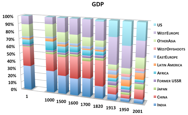
The first question I had when I first graphed the data is, How do India and China account for between 50% and 60% of the world economy for the first 1500 years AD? Until about 1800 when the Industrial Revolution sent productivity skyrocketing at an unprecedented pace, income growth was slow and and relatively even around the world. As a result, the regions with the biggest economies were basically just the regions with the biggest populations.
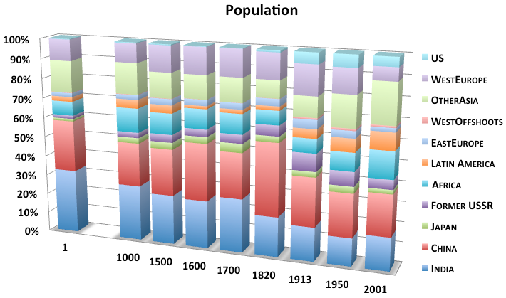
So let's look at populations. This graph, from the same historical data set, shows the distribution of people across regions for the last 2000 years. As you'll see, it's a much more static picture than GDP. China, India, and south-east Asia are still among the densest places on earth, just as they were 2000 years ago. Western Europe is still highly livable. Africa's share of the world's population has rarely deviated from 7% - 13% band. Two millennia ago, Japan had 1.3% of the world's people. Today it has about 2%.
The West started to outpace the rest of the world after 1000, but its rate of technological advancement was pretty pathetic compared to what we saw after the 19th century.
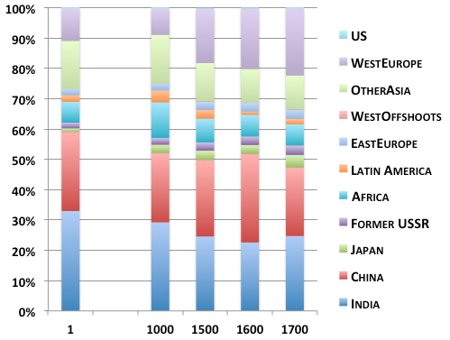
Here's a stat to sum that up. According to A Farewell to Alms, income per person in Western Europe doubled between the 1310s and the 1450s and then fell by 25% in real terms by 1600. Why? Because of The Plague. By reducing the number of people competing for scarce food, the Black Death did more for average incomes than any existing technology of its time. "In the preindustrial world," Gregory Clark writes, "sporadic technological advance produced people, not wealth."* That is the Malthusian Trap in a nutshell. Look how similar GDP across regions was for the first 1700 years since BC ...
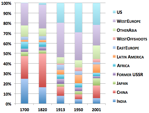
... and now look how wild things got since the Industrial Revolution (pay particular attention to the US in light blue and China/India at the bottom).
In one fascinating passage of Clark's book, he produces a table of laborers' wages measured in pounds of wheat, starting in Ancient Babylonia and taking us through 1780's England. This statistic is so important because it measures what ancient workers wages could actually buy. In the last 200 years, food has gone from 80 percent of our budget to about 10 percent. That's a great indication that we've gotten richer and that our wages are stronger relative to the stuff we want. But for thousands of years, wages measured in wheat didn't grow. They yo-yo'd. I've reproduced Clark's graph below (but buy his book so he won't get mad).
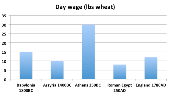
You're looking at the curse of Malthus. Now that's some serious income stagnation.
_______
* Clark's final thesis about how evolution powered the industrial revolution is controversial, but his basic read of the pre-industrial world is not.
><